
Output review
What the current Seedream 5 Pro gallery gets right and what still needs review
This is a visual inspection of the examples published on dream5.pro, not a synthetic score or a vendor benchmark.
Evidence boundary
The public files do not retain generation IDs, seeds, timing or complete model metadata. We therefore describe only what is visible in the images and do not present latency, consistency or attribution claims as measured facts.
01
Review method
We inspect large typography, small text, subject anatomy, material rendering, spatial geometry and whether the image is usable without hiding visible defects.
02
Four visible examples
The set covers a poster, portrait, interior and campaign layout. Each reveals a different production risk.
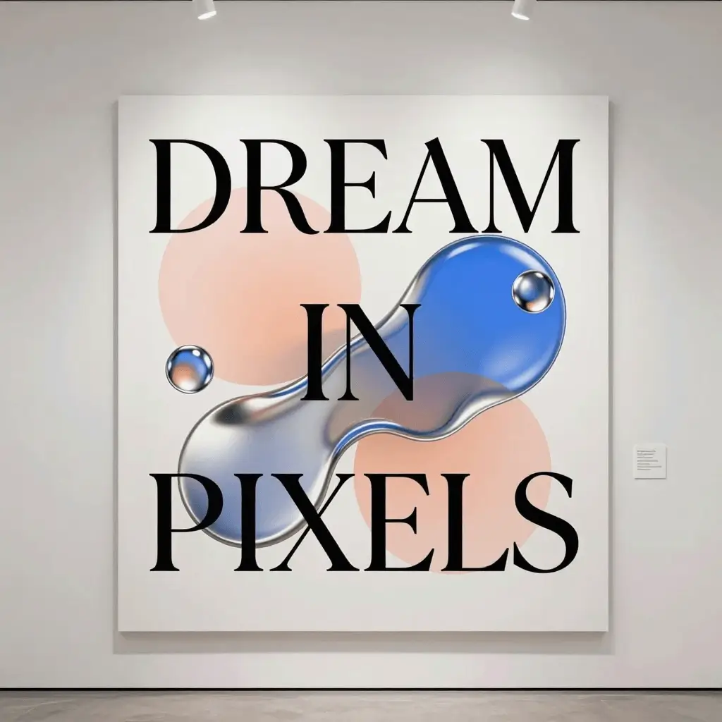
01
Large-type poster
- What holds up
- The three large words are readable and the composition has a clear hierarchy.
- What to check
- The work tests large lettering, not dense body copy or multilingual labels.
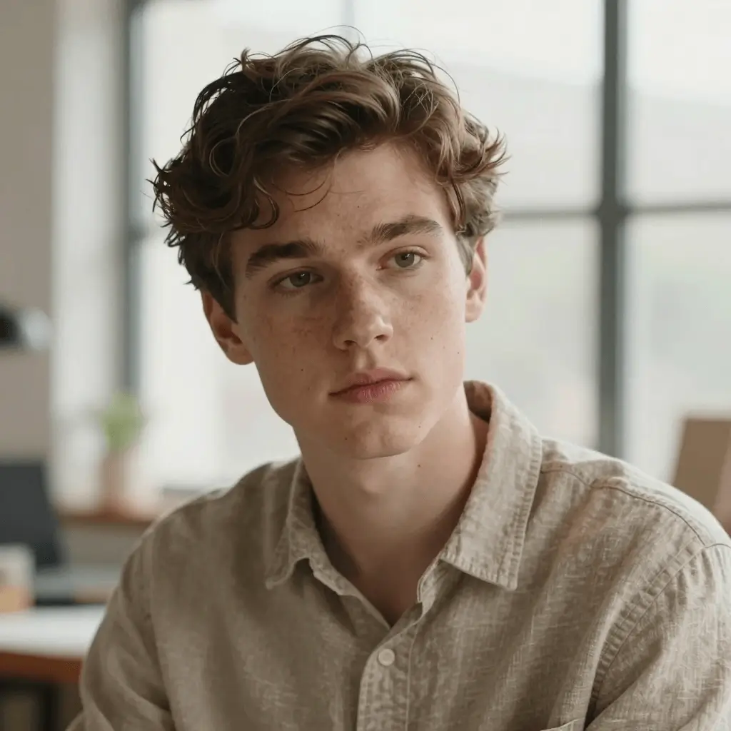
02
Natural-light portrait
- What holds up
- Skin, hair and depth of field read naturally at normal viewing size.
- What to check
- Fine hair edges and facial asymmetry still deserve a full-resolution check.

03
Architectural interior
- What holds up
- The room keeps a coherent material palette and convincing directional light.
- What to check
- Books, shelf repetition and furniture joins need close inspection before commercial use.
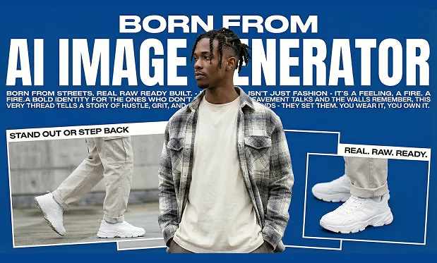
04
Campaign layout with text
- What holds up
- The main headline, subject separation and blue-white hierarchy are immediately legible.
- What to check
- Small supporting copy is not reliably readable and should be replaced in a design tool.
03
Practical verdict
The gallery is strongest as a source of composition-ready drafts: large display text, portraits and editorial scenes hold up best. Small typography and repeated structural detail still require human inspection and often a finishing pass.
Open Seedream 5 ProFAQ
Review questions
Is this a controlled Seedream 5 Pro benchmark?
No. It is a transparent review of the current public gallery. The published assets do not include enough metadata for a controlled benchmark.
What looks strongest in this set?
Large display typography, portrait lighting and broad editorial composition are the clearest strengths visible in the four examples.
What should be checked before publishing?
Inspect small text, repeated objects, joins, hands, facial details and brand-critical product geometry at full resolution.